Project Overview
SUPPLY ROOM is a local supplier's online store aimed to match their in-store quality services and support their transition to a nationwide supplier.
The Problem
The current website makes it difficult for users to find products, leading to frustration and potential loss of customers to competitors or physical store visits.
The Solution
Revamp the user interface and information architecture for effortless product discovery. Create a user-friendly dashboard for easy ordering and expert access, and build an online community to enhance trust, engagement and customer retention.
Role : User Interview and Research | UX Design | Prototyping | Information Architecture | UI Design
Tools: Figma | Figjam
Highlights at a Glance
Comprehensive website redesign catering to B2B and B2C user base, offering easy account management, direct access to experts and social community
Research
Insights from Current Website
I initiated the research process by performing a Heuristic Evaluation of the existing website and identifying existing usability issues. Resolving the issues listed below were the highest priority in the redesign, due to the high the bounce rate of the current website.
Current Home Page
Current Product Browsing Page
Current Product Page
Company's Facebook Page
Company's Facebook page Analytics indicated higher user engagement with the informative and educational content shared on the platform.
This finding underscores the importance of educational content to customers and reveals a potential marketing and SEO opportunity for the business.
Business Model
Understanding the products offered by the business and the nature of maintaining a supply inherently implies that users will return to shop again when it's time to restock their supplies.
This insight emphasizes the importance of looking into recurring orders and understanding users' attitudes about services like subscription services.
User Interview Results
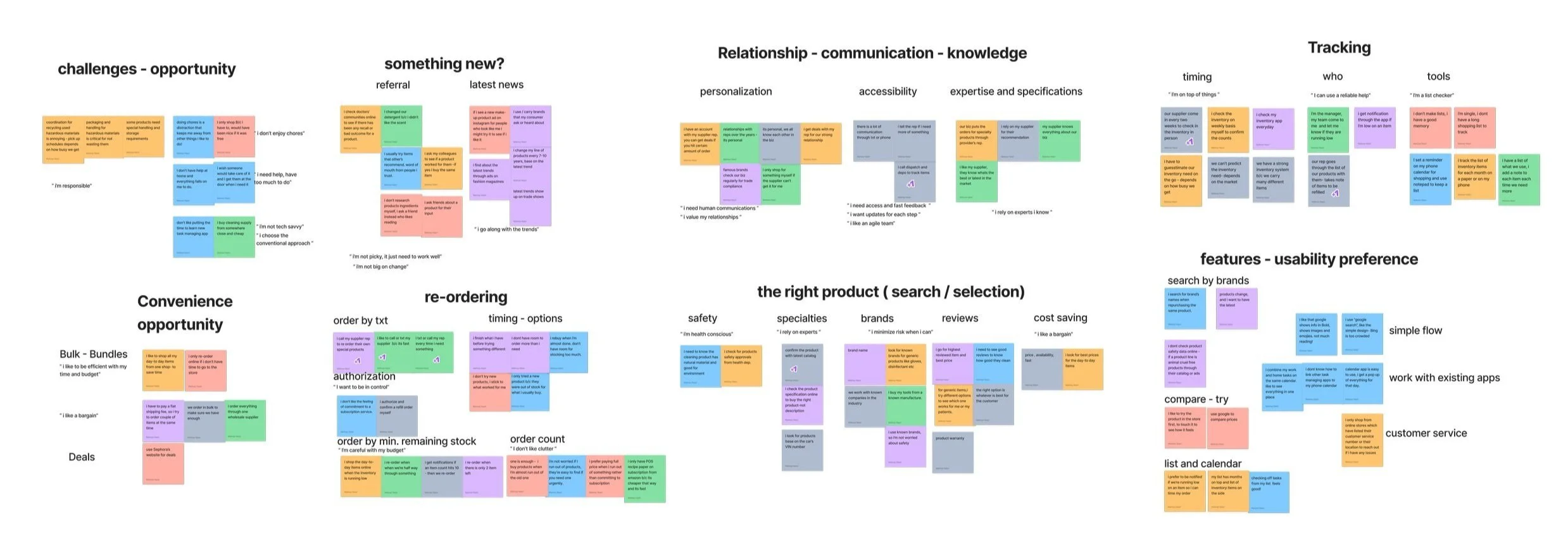
Customer’s Needs & Attitude Toward Inventory & Restocking Behaviors
Given the tight schedule, I 🚗 drove around the neighborhood 🚗 and got to interview 7 target users, primarily B2B customers. I organized the gathered data into an affinity map to identify shared patterns and insights. which led to my personas:
70%
B2B User
Needs Direct Communication With Their Trusted Supplier
Relies on Supplier’s Expertise
30%
D2C User
Relies Heavily on Friend’s Referrals and Reviews
Tries New Community / Social Media Trends
“
“I like to call or txt my supplier because its fast and he knows the best option in the market”
“I usually try items that others recommend”
“I usually order the same item but don’t like committing to a subscription service”
“I have a list to track items”
”
Ideating Solutions
Addressing user’s key problems
Understanding the user's main need for informed decisions and support during and after their order, answering these questions helped me find the right solutions for their key problems:
HMW make people feel confident in being informed on the latest trends?
Easy Access to Experts for B2B users
HMW help users trust the information they’re seeking?
Community Support for Building Trust
HMW help users plan and maintain their inventory orders?
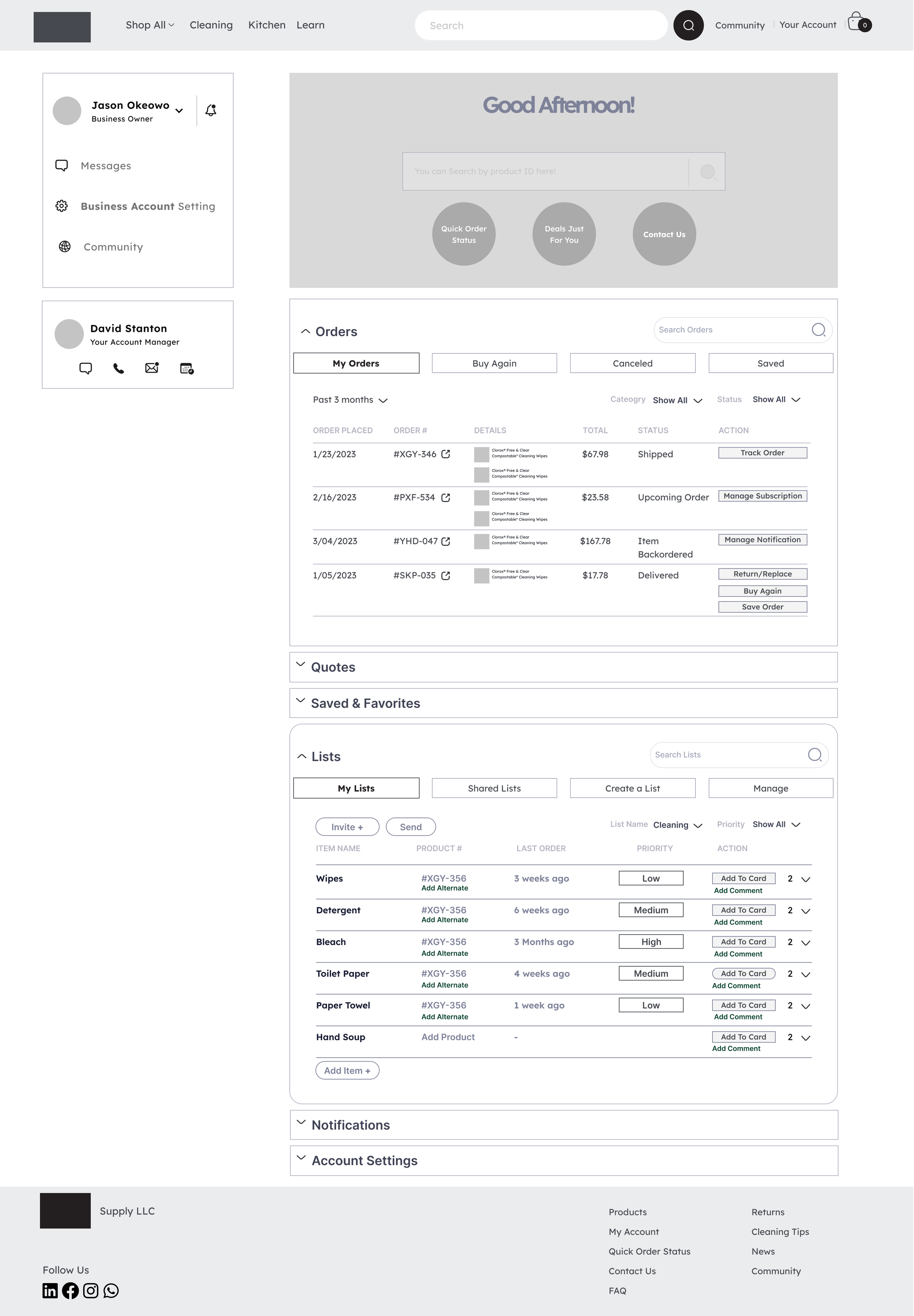
a Dashboard system for Managing orders
Following a Familiar Flow
Improving Current User Journey
For both user groups, frustrations typically arise during product searches and, occasionally, after purchase. Users find relief when they receive support from experts or their community throughout the process. So I enhanced the current user flow by:
Adding Support during product selection
Access to personalized Dashboard for quick re-order and inventory management
Cart Sorting and Product Categories
Finding products on the website
Finding products was another key problem with the current website. I set up an open card sorting exercise, where I asked eight users to categorize the products listed on the existing website and provide names for each category.
This helped to create a seamless product discovery experience for the users.
Information Architecture
Creating a seamless navigation
A crucial aspect of the initial design was to provide access to the community, dashboard, and educational information not just from the main page but consistently throughout the time spent on the website, ensuring that users can access them at any point of their journey, as shown below:


Usability Test and Iterations
Mid-fi Prototype for early usability testing
I developed my initial sketches into mid-fi Prototype for early usability testing before spending more time creating a hi-fi prototype.
I set the completion rate of following tasks without any instruction as success measure:
Brows and Select Products
Manage Orders
Access to Experts and Educational Information
What worked
Product Selection
4/4 users found the product categories clear and understandable.
4/4 users liked the additional features of Product Comparison, Bundles and Similar products while looking for a product.
Order Management
4/4 users found the information in dashboard simple and easy to understand.
4/4 used BUY AGAIN to re-order previously bought items with no error or instruction.
Access to Experts & Education Info
4/4 appreciated having access to an assigned account manager through their dashboard
4/4 users appreciated having access to “Tips” to learn more when they need it.
“
“This is easy and convenient ”
“ I really like this dashboard, everything I need is here”
“ Its nice to know I can learn cleaning tips in this website”
”
What didn’t work
4/4 users found the LIST very helpful, asked whether the priority column could be filled automatically?
Although the original design intention was for the users to manually input data to the priority column, my observation of the user’s behavior cleared that users preferred an automatic feature. Implementing this feature would require feasibility consultation with a developer.
How it was revised
4/4 users Preferred for the News / Tips to be relocated at the bottom of the homepage
All users appreciated having access to Tips/News but expressed it was unnecessary if they already knew what they were purchasing. Consequently, in the redesign, this section has been moved to the bottom of the page.
The “Information” Conundrum!
0/4 users clicked on Community Page during their shopping journey! However, after introducing them to the page:
3/4 users appreciated the idea of having a community page, believing it’d add credibility and trustworthiness to the supplier!
Since building trust was one of the design challenges, receiving this insight from the user was affirming we’re on the right path. as the result, I decided to keep the feature in final design.
Branding & Final Design
Introducing a Fresh Interface
Incorporating feedback from usability testing, I redesigned the pages to a high-fidelity design, using this UI kit and a new branding.
The overarching theme centers around simplicity and organization, avoiding clutter. Vibrant pops of yellow and blue were introduced to infuse a sense of freshness, cleanliness, and energy into the design.
Prototype Walkthrough
Above pages are my visual design explorations based on the original prototype. You can view the previous UI in the prototype below.
Lessons Learned
Reflecting on the project outcome
as one of my first UX projects, I loved working on this project as I tried and tested different design strategies to ensure a user-centered design and learned lessons valuable for future projects
01
Getting out of comfort zone is rewarding
For this project, I drove around the neighborhood and chatted with business owners about their inventory processes. It was a bit intimidating at first, but the insights I gained were priceless. These conversations became the guiding star in my design process, turning a humbling experience into a rewarding one.
02
Social Features should help not overwhelm
My research confirmed the need for social and community features, but some users resisted joining another social platform. They want the benefits of online communities without information overload. This highlights the importance of keeping information concise and respecting user’s privacy with transparency.


